
Design System
Modernising shadow styles for The Telegraph
Project Type
Design System
Role
Co-Design System lead for Elevations — UX Researcher, Documentation Specialist, UI Design, Interaction Designer
Team Members
Hugo Spilker • Co-Design Lead
Project Length
July — September 2024 (Published)
Highlights

The Problem
Rethinking the shadows
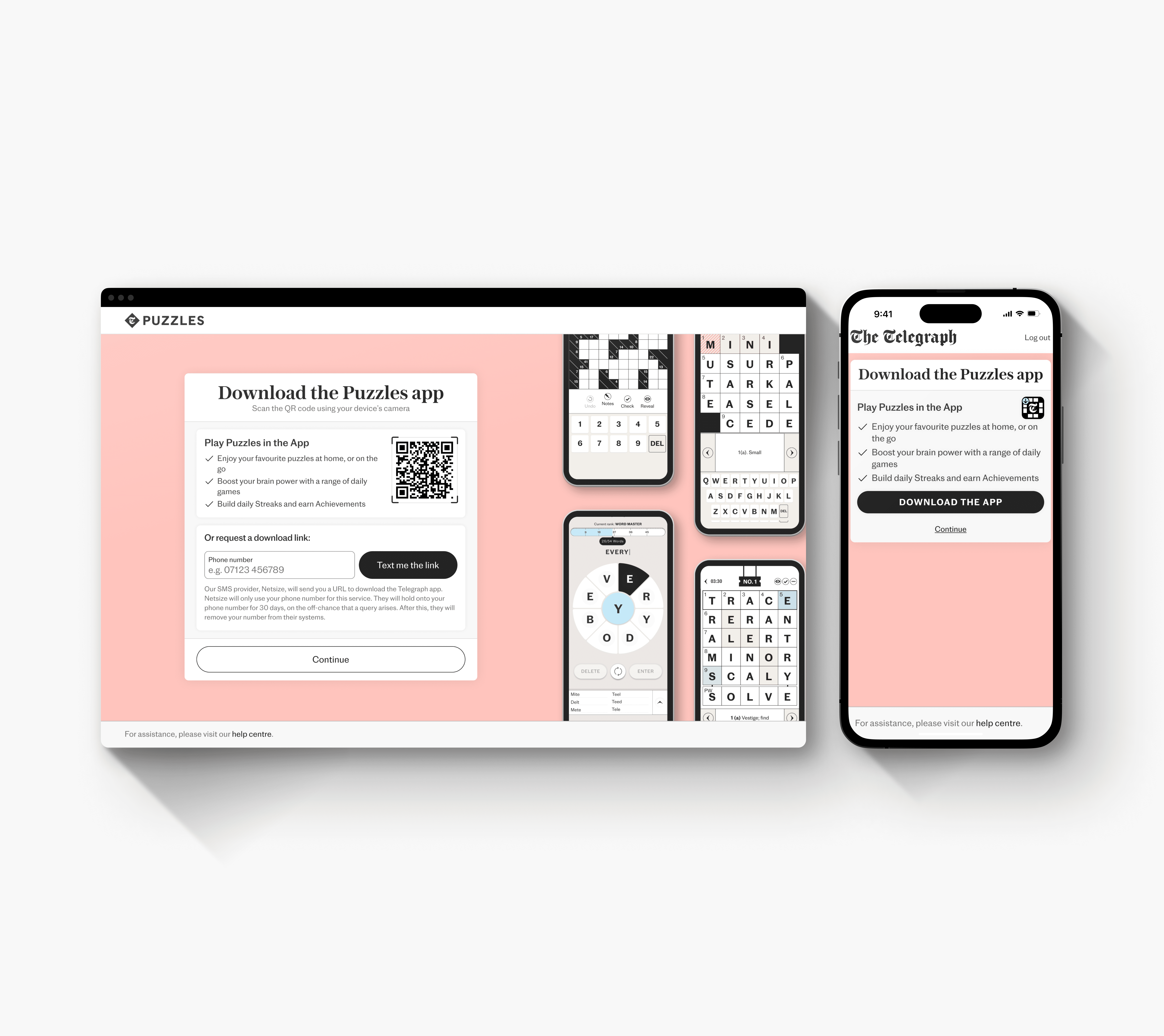
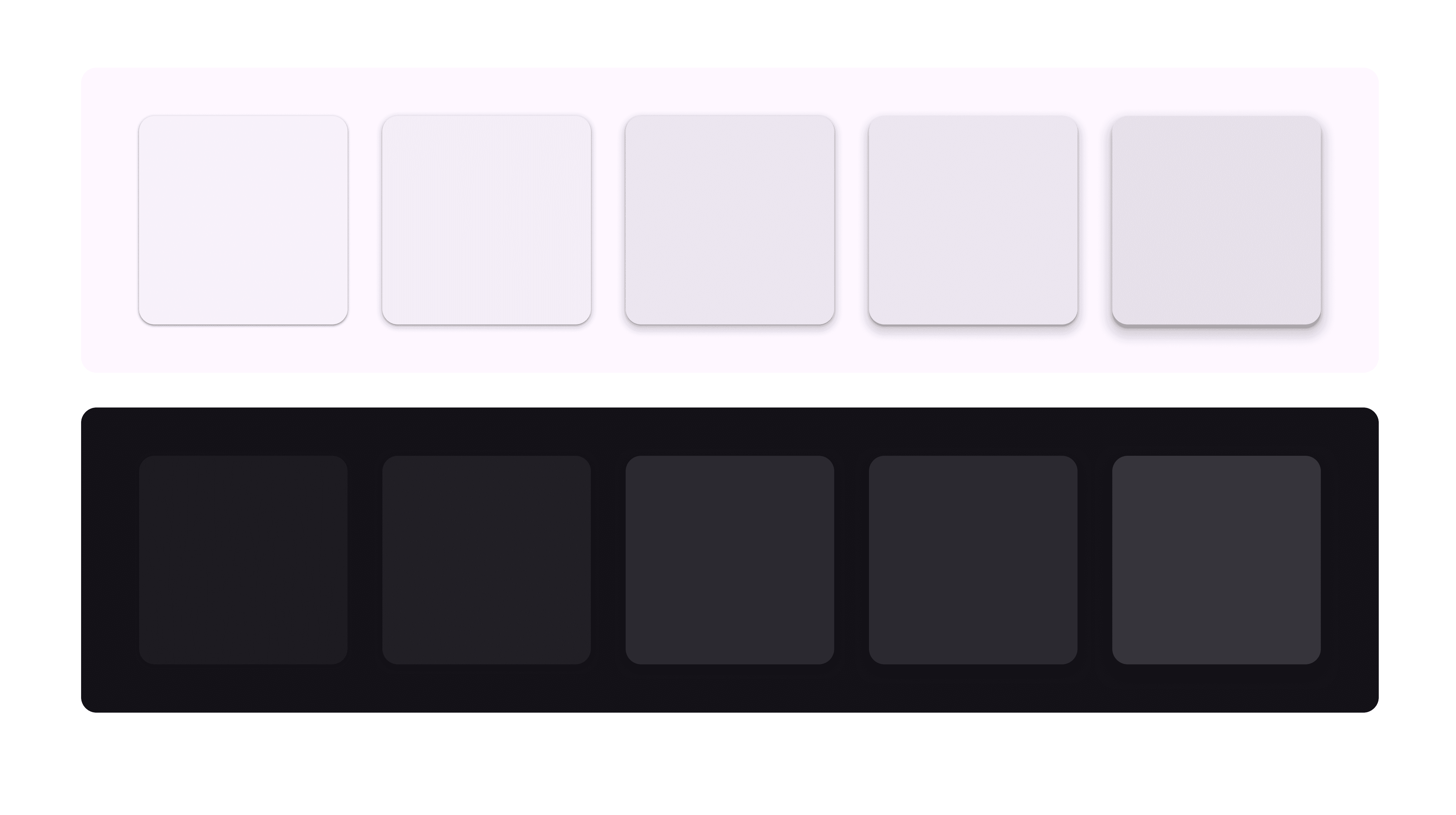
Like many digital products, The Telegraph currently uses a soft, single-layer shadow. We usually adjust depth by tweaking opacity and spread, which helps with separation and clarity but doesn’t reach its full potential for visual impact.

Unlike other parts of the design system, the effects category hadn’t been fully explored. Shadow usage varied widely across teams without a consistent style, leading to effects being copied between files instead of applied as a standard from the library. Driven by these insights, we set out to develop a solution.
Hypotheses
"How can we craft a modern shadow style that adds depth, ensures consistency, and elevates The Telegraph's visual language?"
Our goal was to address several key points below:
Update the shadow style to improve the overall design
Introduce "elevation" to add depth to our design strategy
Build consistency across teams, as shadow use currently varies a lot
Strengthen The Telegraph's digital presence to align with business goals
Research
Insights from the industry
Next, we analysed products from companies like Apple, Meta, and Google to understand how they apply shadows. This competitive audit gave us valuable insights, especially from Google’s Material Design system, including both the original and the latest Material Design 3.
The biggest takeaway was Google's concept of 'Elevation.' Rather than just calling them shadows, Google’s design team approached shadows at a conceptual level, integrating techniques like tonal colour differences, scrims, and glassmorphism. We saw that elevation is about more than shadows—it’s about creating layered depth.
While this concept is subtly embedded in designers' thinking, it was eye-opening to see how digital design layers range from the flattest level 0 to the highest level 5, covering elements like scrims and overlays.
This approach inspired us to apply a similar logic to our shadows, making it easier to communicate how they’re used and helping The Telegraph’s design team layer their designs with greater intention.
Gathering Insights
Re-thinking shadows to achieve greater depth
While Material Design offered helpful insights, it fell short of our goal to enhance visual impact and elevate our digital presence—the shadows felt too flat. This sparked us to look to innovative websites that push the boundaries of design and interaction, focusing on craftsmanship.
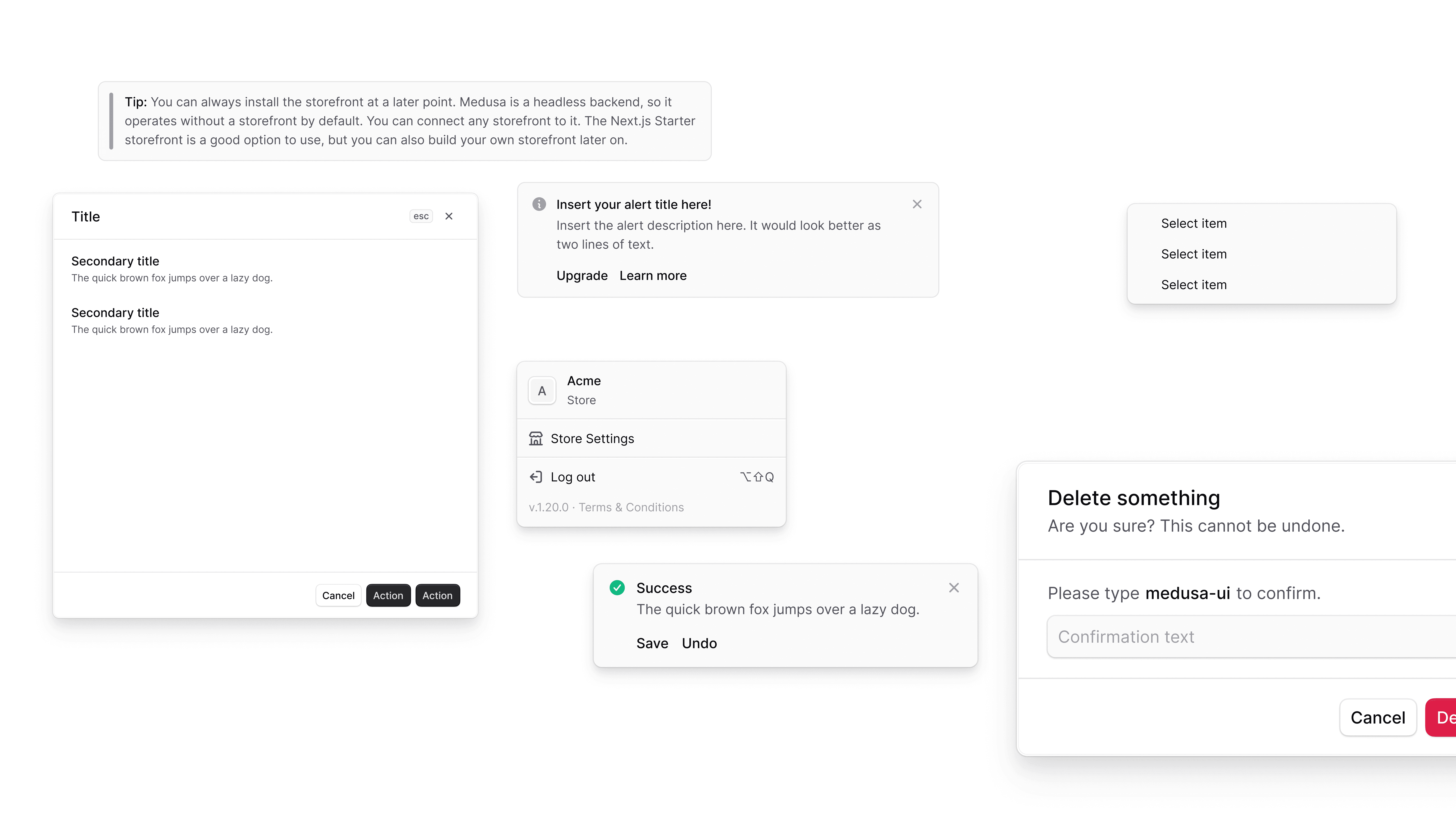
One standout, 'Medusa UI,' used a clever blend of strokes and shadows. As we explored different design systems, we found a key insight: creating true depth required layering multiple shadow levels in both Figma and front-end code. This discovery led us to the ideal approach for updating our shadows.
Iteration
Creating the perfect elevation
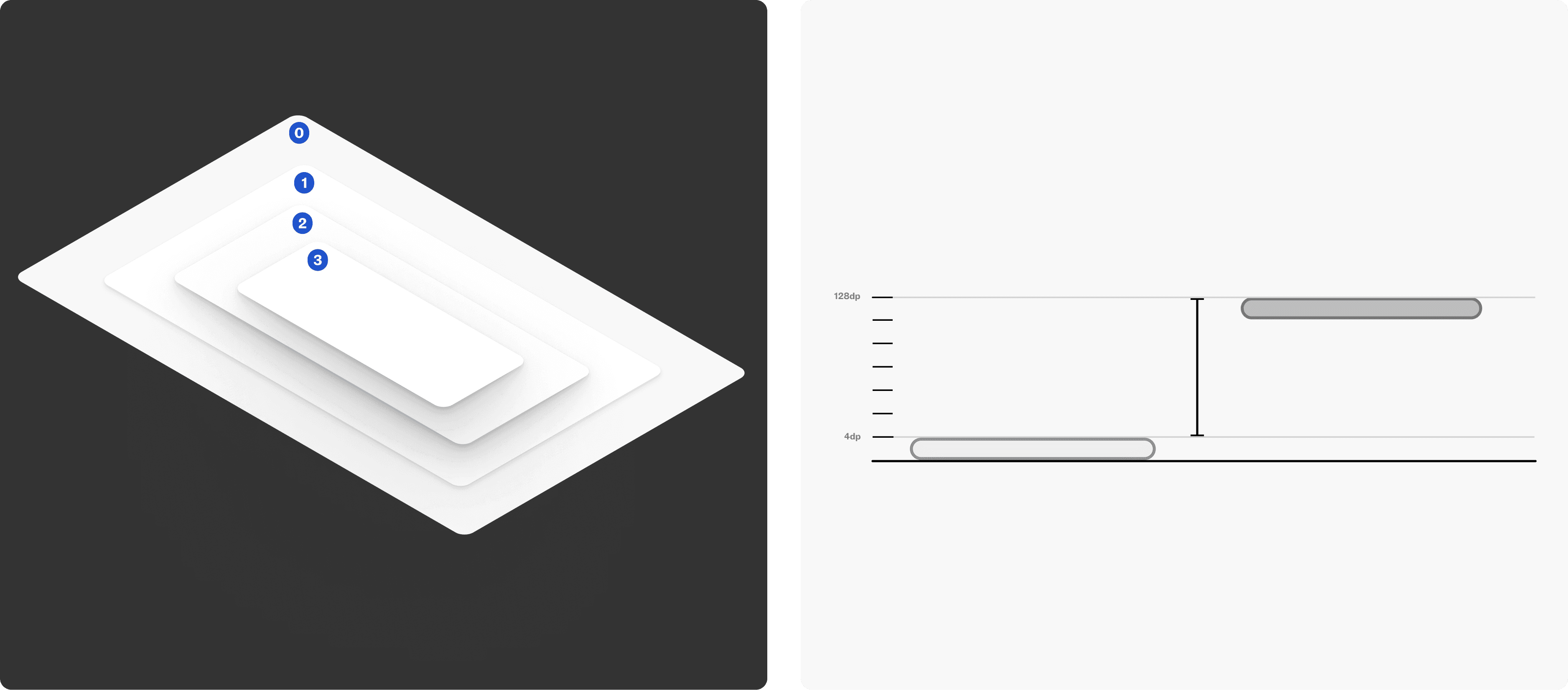
With these insights, we began testing elevations and experimenting with shadow intensity, adjusting opacity, spread, colour, and position. Hitting Figma's eight-layer limit, we refined our approach to design the best elevation 'palette' within these constraints.
We started with a 2px blur and doubled it for each level, so deeper shadows like level 3 reached 128px. We applied the same approach to the Y radius, keeping the hex value and opacity consistent to maintain shadow intensity.

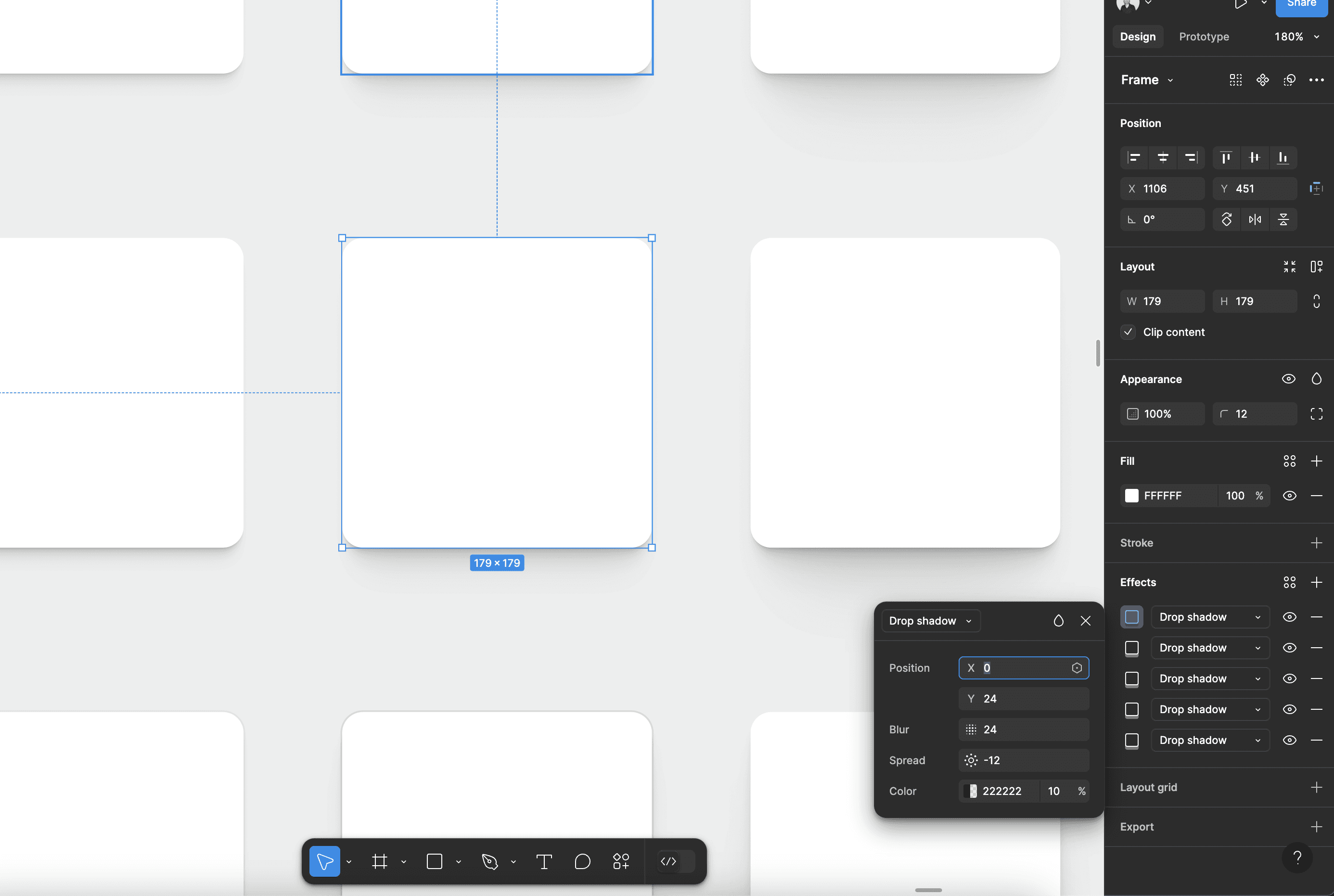
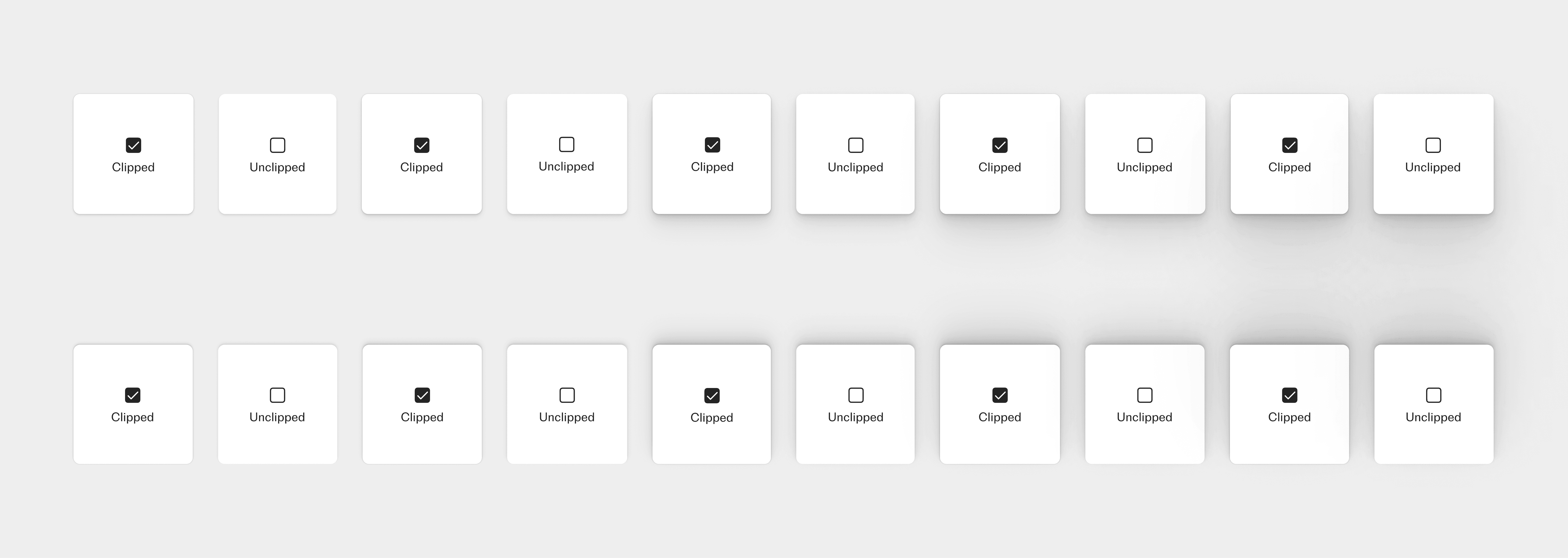
An insight from systems like 'Medusa UI' was how they integrated strokes into the shadow itself. We found that layering a separate stroke with a shadow often looked unbalanced, as strokes and effects sit on different layers in Figma. To make strokes visible, we also had to clip the frame.
We applied these test shadows in current projects to assess real-world performance and conducted beta testing of our initial palettes with a select group of team members. This process provided essential insights:
Fewer levels
Many designers found our initial test of 5 shadow levels excessive, as launching with this many would mean justifying the use case for each one.
Use cases:
We saw the need for clear use cases and examples for each shadow level to guide designers in applying them consistently and purposefully.
Final Designs
In the final result, we developed three elevation levels for each stroke colour token, combining the new shadow with the stroke. This approach ensures a more consistent system, making it easier for designers to select the right colour.
More Projects
WEB & APP
Faceted Search